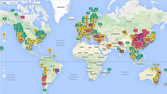
14. Air Pollution Map
The Air Pollution map shows real time air quality index for a large number of cities around the world. It represents the degree to which air is polluted by various industrial emissions and traffic (basically smog), which affects its quality for breathing. Latest values are colored in green representing good air quality, yellow and orange for somewhat lower quality, and red representing bad quality.
Looking at the amount of orange and red in China makes it clear that China has a major issue with air quality.
Follow Us!